In any theme, a palette of pre-defined colors is determined for easy user access, allowing color use to stay true-to-brand. Additionally, these palettes determine how color selection cascades out into overall theme design. There are three different palette areas: | The Core Palette | The Tints and Shades Palette | The Grays Palette |
|---|
These are three distinct colors that can be used to identify a space for a company, a department, a product, or a specific activity. 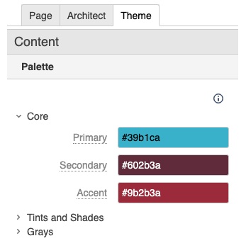
| This palette defines light, medium and dark tints/shades that coordinate with the Core Palette. 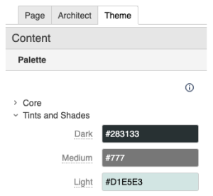
| This palette of white, light gray, medium gray, and dark gray is used to provide emphasis and variety. 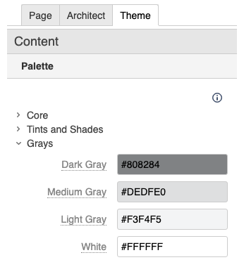
|
- The palette options are displayed directly below the color picker in any color selection context, within the Theme Press Designer.
- Additionally, the palette options are the first options in the Confluence editor color picker.
- Creating these color palettes does not prevent users from choosing other colors.
| 


